Want to style checkboxes and radio buttons without endless custom hacks? Meet accent-color — a modern CSS property that makes customizing native form controls a breeze! No more fussy pseudo-elements or replacing checkboxes with icons. With just one line, you can match your brand’s look across all form elements. In this MiniCoursey quick guide, you’ll learn what accent-color does, how to use it, and best practices for modern, accessible forms.
What is accent-color?
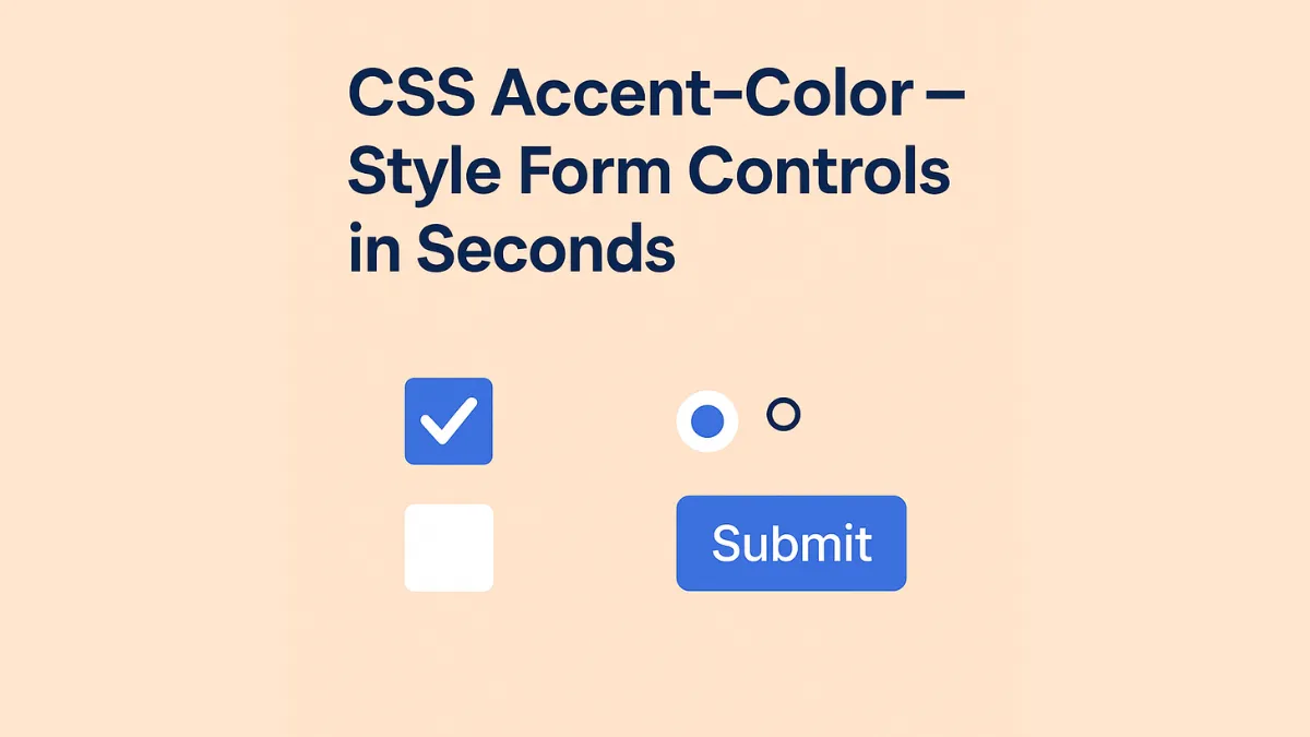
accent-color lets you set the color for the “highlight” parts of form controls — like checkboxes, radio buttons, switches, and progress bars — without fully rebuilding them from scratch.
Basic Syntax
Just add accent-color to the element you want to style.
input[type=”checkbox”] {
  accent-color: #007bff;
}
Now your checkboxes match your primary brand color — easy!
Why Use accent-color?
- Customize native controls quickly with zero extra markup.
- Keep your forms accessible and consistent with the browser’s built-in focus and states.
- Works on checkboxes, radio buttons, progress bars, and some input sliders.
💡 Pro Tip: Combine with color variables to sync your UI theme easily.
⚠️ Common Mistake: Don’t use
accent-coloras a replacement for fully custom UI elements — it’s for simple, native tweaks.
FAQ
Q: Is accent-color well supported?
A: Yes! All major modern browsers support it today — check MDN for edge cases.
Q: Can I use it on custom checkboxes?
A: No — it only affects native controls. For custom elements, you’ll still need custom CSS or JS.
Related Link
👉 Check out previous: CSS Layered Color Mixing — Advanced Color Control
Where to Learn More
Visit MDN’s accent-color docs for full support tables and extra examples.
Conclusion
Congrats — you now know how to style form controls in seconds with accent-color! Keep your forms beautiful and accessible with modern CSS.
✨ Bookmark MiniCoursey for more quick & free mini courses!
1 thought on “CSS Accent-Color — Style Form Controls in Seconds”