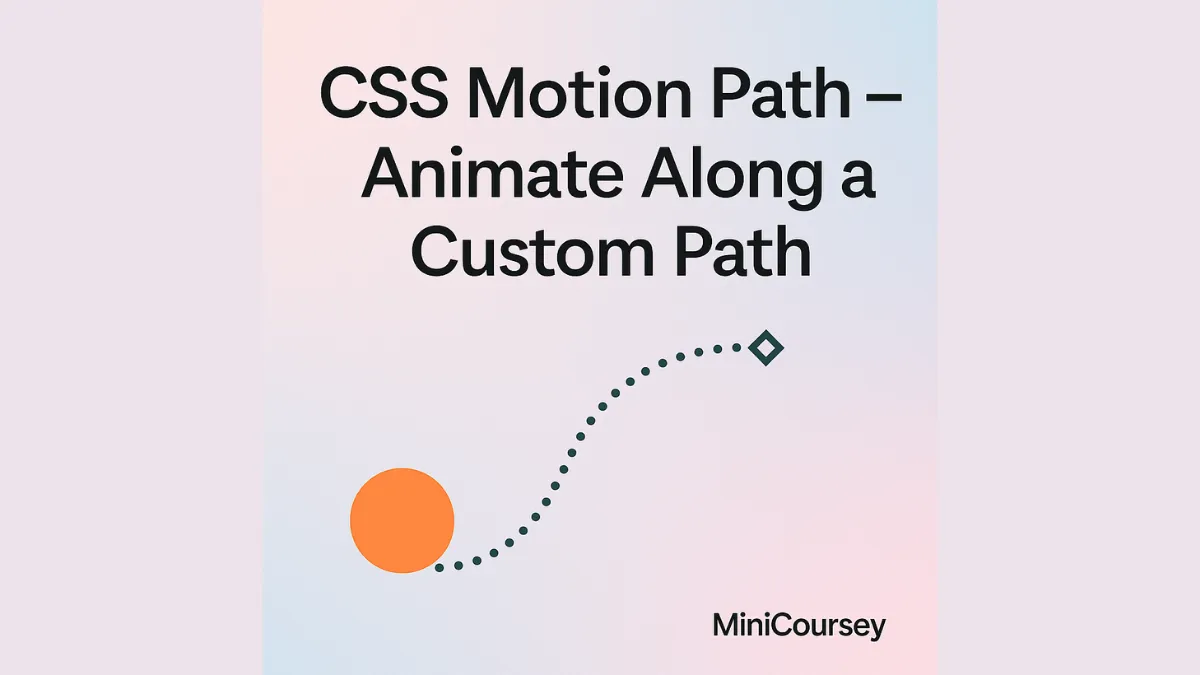
Want to animate elements along curves, circles, or any custom path — without JavaScript? That’s what CSS Motion Path does! Using the offset-path and related properties, you can create advanced motion animations that follow any shape you define. Perfect for logos, decorative elements, or eye-catching hero sections. In this MiniCoursey quick guide, you’ll learn what Motion Path is, how to set it up, and best practices for smooth, creative animations.
What is Motion Path?
Motion Path lets you animate an element along a defined path using offset-path. You control the path shape and the element’s position along it with offset-distance.
Basic Syntax
Define the path and set up the animation.
.ball {
  offset-path: path(‘M0,0 C50,100 150,100 200,0’);
  offset-rotate: auto;
  animation: move 3s infinite alternate ease-in-out;
}

@keyframes move {
  0% { offset-distance: 0%; }
  100% { offset-distance: 100%; }
}
In this example, a ball moves smoothly along a custom curve.
Why Use Motion Path?
- Animate objects along complex shapes with pure CSS.
- No heavy JavaScript libraries needed.
- Combine with transforms and easing for natural motion.
💡 Pro Tip: Use
offset-rotate: autoto keep the element naturally oriented along the path.
⚠️ Common Mistake: Test paths carefully — a tiny syntax error can break your whole animation!
FAQ
Q: Is Motion Path supported everywhere?
A: Most modern browsers support it — but double-check for older versions and mobile quirks.
Q: Can I use SVG paths?
A: Yes! offset-path works with SVG path data for ultimate flexibility.
Related Link
👉 Check out previous: CSS Scroll Snap — Create Slick Scroll Experiences
Where to Learn More
Check MDN’s Motion Path docs for examples and experiment with creative shapes!
Conclusion
Congrats — you now know how to animate elements along custom paths with CSS Motion Path! Bring your UI to life with dynamic, playful motion.
✨ Bookmark MiniCoursey for more quick & free mini courses!