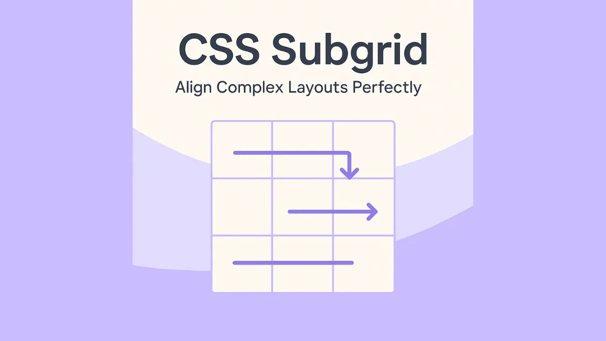
Ever built a grid layout only to struggle with aligning child elements perfectly? Meet subgrid — an advanced CSS Grid feature that lets nested grids inherit their parent’s grid tracks. This solves the age-old problem of manually matching columns and rows inside complex layouts. In this MiniCoursey quick guide, you’ll learn what Subgrid is, how to use it, and why it’s a must-have for pixel-perfect designs.
What is CSS Subgrid?
Subgrid extends CSS Grid by letting child elements share the parent grid’s rows and columns. Instead of redefining tracks, you reuse them — keeping alignment consistent and layouts flexible.
Basic Syntax
Define a grid container with tracks and apply subgrid to child elements.
.parent {
  display: grid;
  grid-template-columns: 1fr 2fr 1fr;
}

.child {
  display: grid;
  grid-template-columns: subgrid;
}
Here, the child grid uses the same columns as its parent — perfect alignment, no fuss.
Why Use Subgrid?
- Keep nested layouts perfectly aligned with parent grids.
- Reduce duplicate track definitions — stay DRY!
- Make responsive grids simpler and more maintainable.
💡 Pro Tip: Combine Subgrid with
grid-template-rowsfor advanced vertical alignment too.
⚠️ Common Mistake: Watch browser support — Subgrid is newer and may need fallbacks for full coverage.
FAQ
Q: Is Subgrid fully supported?
A: Most modern browsers like Firefox support it — Chrome and Safari are adding it soon, so check MDN for updates.
Q: Can I use Subgrid for rows and columns?
A: Yes! Use subgrid for rows, columns, or both depending on your layout needs.
Related Link
👉 Check out previous: CSS Nesting — Write Cleaner, Structured Styles
Where to Learn More
Visit MDN’s Subgrid docs and practice aligning nested components for perfectly tidy layouts.
Conclusion
Congrats — you now know how to align complex layouts perfectly with CSS Subgrid! More control, fewer hacks, cleaner code.
✨ Bookmark MiniCoursey for more quick & free mini courses!

