CSS just keeps getting smarter! Both aspect-ratio and container units help you build layouts that adapt beautifully — but they solve different problems. Knowing when to reach for each is the key to truly flexible, maintainable designs. In this MiniCoursey quick guide, you’ll learn what aspect-ratio and container units do, their differences, and when to use one (or both!) for fluid, component-friendly layouts.
What is CSS aspect-ratio?
The aspect-ratio property locks an element’s width-to-height ratio. It’s perfect for keeping images, videos, cards, or any box-shaped element proportional, no matter the screen or container size.
.card {
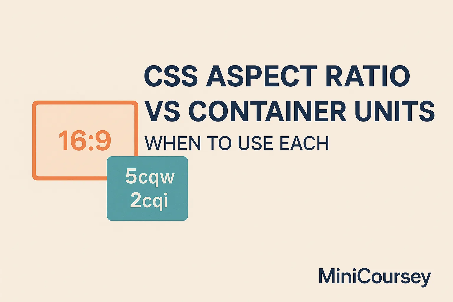
aspect-ratio: 16 / 9;
width: 100%;
}
Here, the card always keeps a 16:9 shape while scaling with its parent’s width.
What Are Container Units?
Container units like cqw and cqh size elements relative to their parent container’s dimensions. This makes component sizing more predictable when combined with container queries.
.card-content {
  font-size: 5cqw;
  padding: 2cqi;
}
In this example, text and spacing adjust based on the parent container’s width and inline size.
Key Difference
aspect-ratio controls an element’s shape.
Container units control the size of content inside, relative to the parent’s size.
When to Use Each
- Use
aspect-ratioto keep boxes proportional — think videos, placeholders, cards. - Use container units for fluid sizing of text, spacing, or child elements inside flexible layouts.
- Combine them! Use
aspect-ratiofor shape and container units for smart inner sizing.
💡 Pro Tip: Use both together for reusable, container-aware components that adapt seamlessly.
⚠️ Common Mistake: Don’t mix up viewport units with container units — they behave differently!
FAQ
Q: Can I nest container units inside aspect-ratio boxes?
A: Absolutely — they work great together for fully responsive components.
Q: Are container units widely supported?
A: Support is rolling out — check browser compatibility if targeting older devices.
Related Link
👉 Check out previous: CSS Container Units — Smarter Fluid Sizing
Where to Learn More
Visit MDN’s docs on aspect-ratio and container units — then try combining them in a real component!
Conclusion
Congrats — you now know when to use aspect ratio vs container units. Together, they unlock truly flexible, modern layouts!
✨ Bookmark MiniCoursey for more quick & free mini courses!
1 thought on “CSS Aspect Ratio vs Container Units — When to Use Each”