CSS Aspect Ratio vs Container Units — When to Use Each
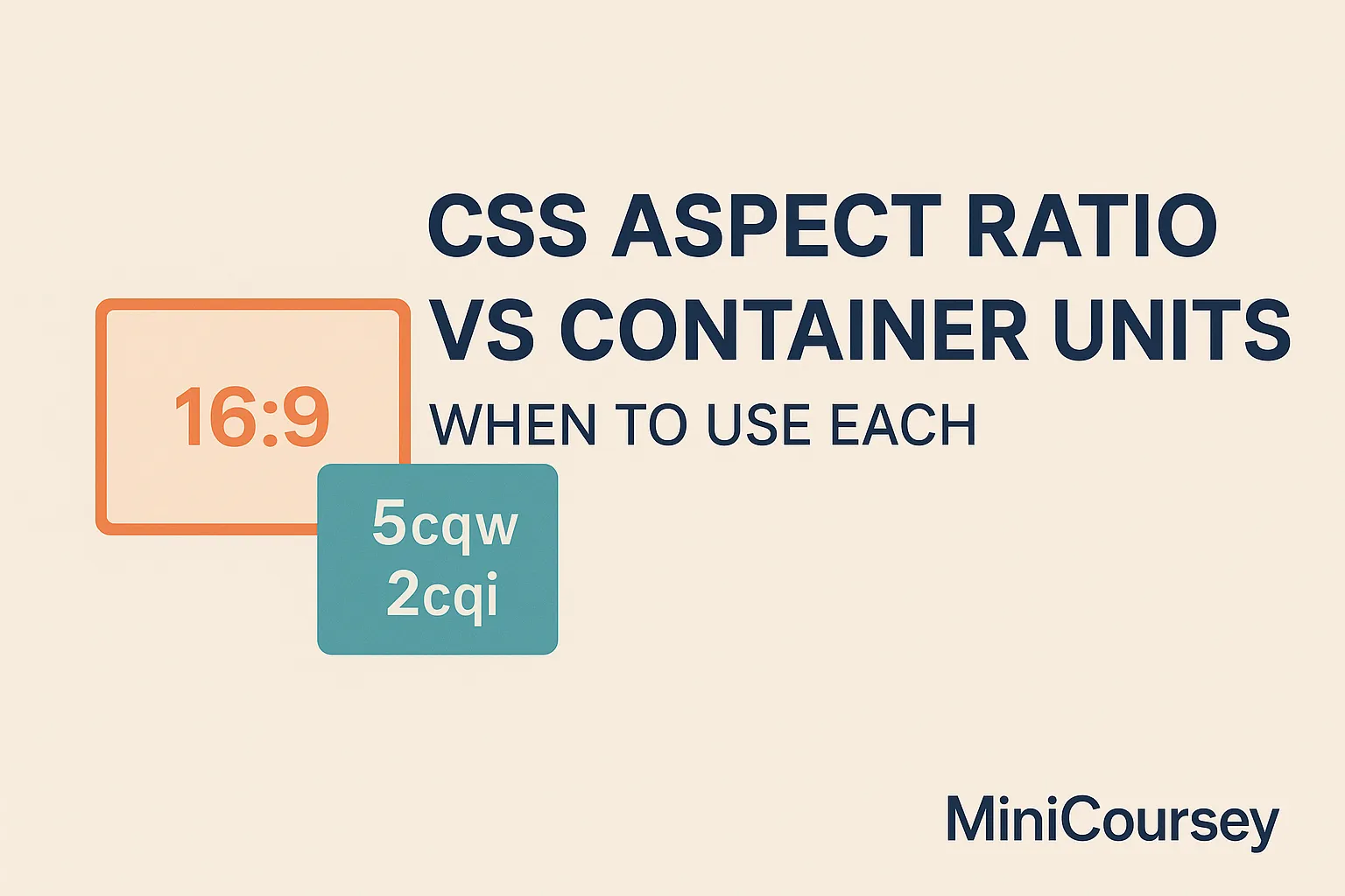
CSS just keeps getting smarter! Both aspect-ratio and container units help you build layouts that adapt beautifully — but they solve different problems. Knowing when to reach for each is the key to truly flexible, maintainable designs. In this MiniCoursey quick guide, you’ll learn what aspect-ratio and container units do, their differences, and when to … Read more