CSS Calc() — Do Math in Your Styles

css calc function

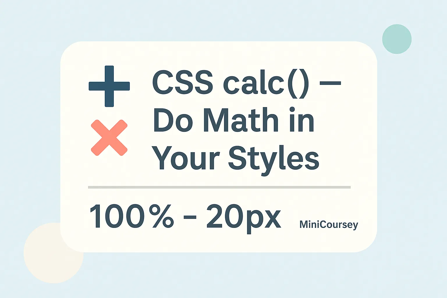
Need flexible sizing without hardcoding everything? The CSS calc() function lets you do simple math right inside your stylesheets — no extra tools needed! With calc(), you can mix units, combine percentages and pixels, or adjust spacing dynamically. It’s perfect for building fluid layouts, responsive components, or fine-tuning tricky gaps. In this MiniCoursey quick guide, … Read more

CSS Media Queries — Make Designs Responsive

css media queries basics

Want your website to look great on any screen? CSS Media Queries are the secret to responsive design. They let you apply different CSS rules depending on a device’s screen size, orientation, or other features. In this MiniCoursey quick guide, you’ll learn what media queries are, how they work, and how to write your first … Read more

Responsive Design Basics — Make Your Site Mobile-Friendly

responsive design basics

Want your website to look great on any device? Responsive design makes sure your layout adapts to screens big and small. In this MiniCoursey quick guide, you’ll learn the basics of responsive design and how to use CSS media queries to make your site mobile-friendly in no time. What is Responsive Design? Responsive design is … Read more

Intro to Flexbox — Make Layouts Easier

flexbox basics

Ever struggled with messy CSS layouts? Flexbox makes it so much easier. In this MiniCoursey quick guide, you’ll learn Flexbox basics step by step — so you can align, distribute, and organize page elements without headaches. What is Flexbox? Flexbox (Flexible Box Layout) is a CSS layout model that lets you build one-dimensional layouts easily … Read more