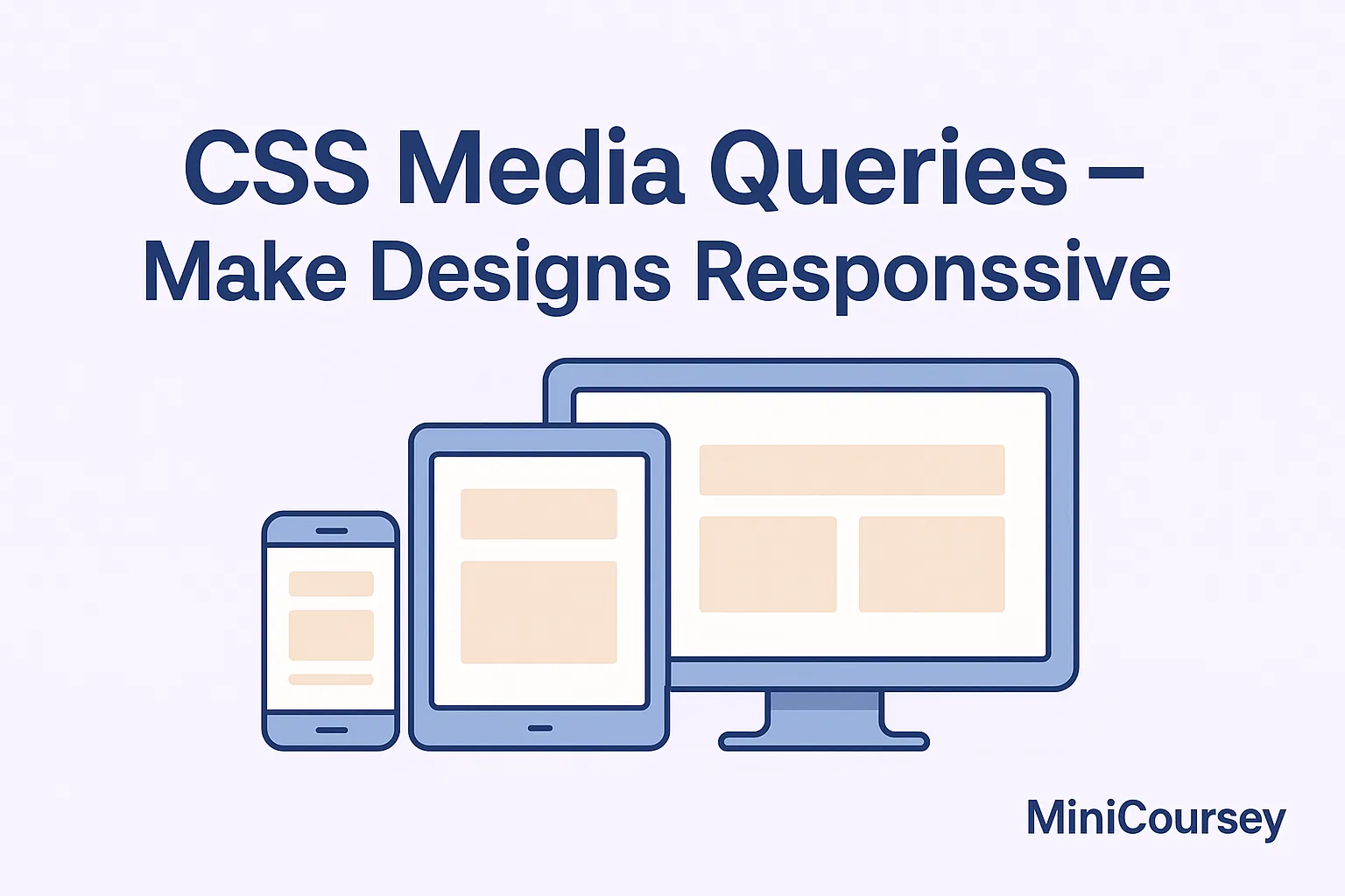
Want your website to look great on any screen? CSS Media Queries are the secret to responsive design. They let you apply different CSS rules depending on a device’s screen size, orientation, or other features. In this MiniCoursey quick guide, you’ll learn what media queries are, how they work, and how to write your first breakpoints to make your designs flexible and mobile-friendly.
What are CSS Media Queries?
Media Queries are conditional rules that check for certain conditions like screen width, height, resolution, or orientation. When the condition matches, the specified CSS is applied. This means you can adapt your layouts for phones, tablets, desktops, or even TVs — all with the same HTML.
Basic Media Query Syntax
The most common use is setting breakpoints for different screen widths. For example, you might have one style for desktops and another for mobile devices.
/* Default desktop styles */
.container {
  width: 80%;
}

/* Mobile styles */
@media (max-width: 768px) {
  .container {
    width: 95%;
  }
}
Common Breakpoints
While breakpoints can vary by design, common screen width breakpoints include:
- 1200px — Large screens
- 992px — Tablets / small desktops
- 768px — Tablets / landscape phones
- 480px — Mobile phones
Combining Conditions
You can combine multiple conditions with and to target even more specific scenarios.
@media (min-width: 768px) and (max-width: 1024px) {
  .container {
    padding: 40px;
  }
}
💡 Pro Tip: Always test your breakpoints on real devices or browser responsive tools.
⚠️ Common Mistake: Avoid using too many breakpoints — start with a few that make sense for your content.
FAQ
Q: Should I design mobile-first?
A: Yes — it’s best practice to write styles for small screens first, then add media queries for larger screens.
Q: Can media queries check orientation?
A: Absolutely! You can target landscape or portrait mode with orientation: landscape.
Related Link
👉 Check out previous: CSS Specificity — How CSS Rules Win
Where to Learn More
Practice by building a simple landing page that adapts at different widths. MDN has a great Media Queries guide with lots of real-world examples.
Conclusion
Congrats — you now know how to use CSS Media Queries to build flexible, responsive designs that look good on any device!
✨ Bookmark MiniCoursey for more quick & free mini courses!