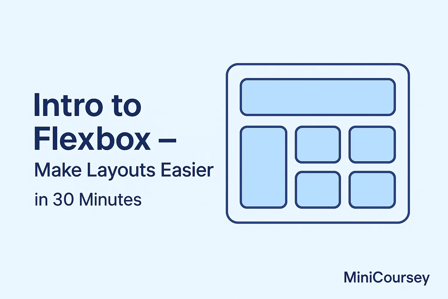
Ever struggled with messy CSS layouts? Flexbox makes it so much easier. In this MiniCoursey quick guide, you’ll learn Flexbox basics step by step — so you can align, distribute, and organize page elements without headaches.
What is Flexbox?
Flexbox (Flexible Box Layout) is a CSS layout model that lets you build one-dimensional layouts easily — horizontal or vertical. No more complicated floats or manual positioning.
How to Get Started
You only need to add display: flex to a container to make its children flexible.
.container {
  display: flex;
}
Main Flexbox Properties
flex-direction
Sets the direction of the items: row (default) or column.
.container {
  flex-direction: row;
}
justify-content
Controls horizontal alignment.
.container {
  justify-content: center;
}
align-items
Controls vertical alignment.
.container {
  align-items: center;
}
Example — Center Content
A quick way to center content both ways:
.container {
  display: flex;
  justify-content: center;
  align-items: center;
  height: 100vh;
}
💡 Pro Tip: Use
gapto add spacing between flex items without extra margins.
⚠️ Common Mistake: Using
floatwith Flexbox often causes conflicts — stick to Flex properties only.
FAQ
Q: Does Flexbox replace Grid?
A: Not exactly — Flexbox is great for one-dimensional layouts; Grid works best for two-dimensional.
Q: Can I use Flexbox for navigation bars?
A: Absolutely! It’s perfect for horizontal nav menus.
Related Link
👉 Check out previous: Build a Simple Landing Page with HTML & CSS
Where to Learn More
Practice Flexbox with real projects! Try interactive tools like Flexbox Froggy or read MDN’s Flexbox guide.
Conclusion
Congrats — you now know the basics of Flexbox! Keep practicing to master flexible layouts.
✨ Bookmark MiniCoursey for more quick & free mini courses!