Need more control over complex layouts? CSS Grid makes building 2D layouts simple and powerful. In this MiniCoursey quick guide, you’ll learn the basics of CSS Grid and create your first responsive grid step by step.
What is CSS Grid?
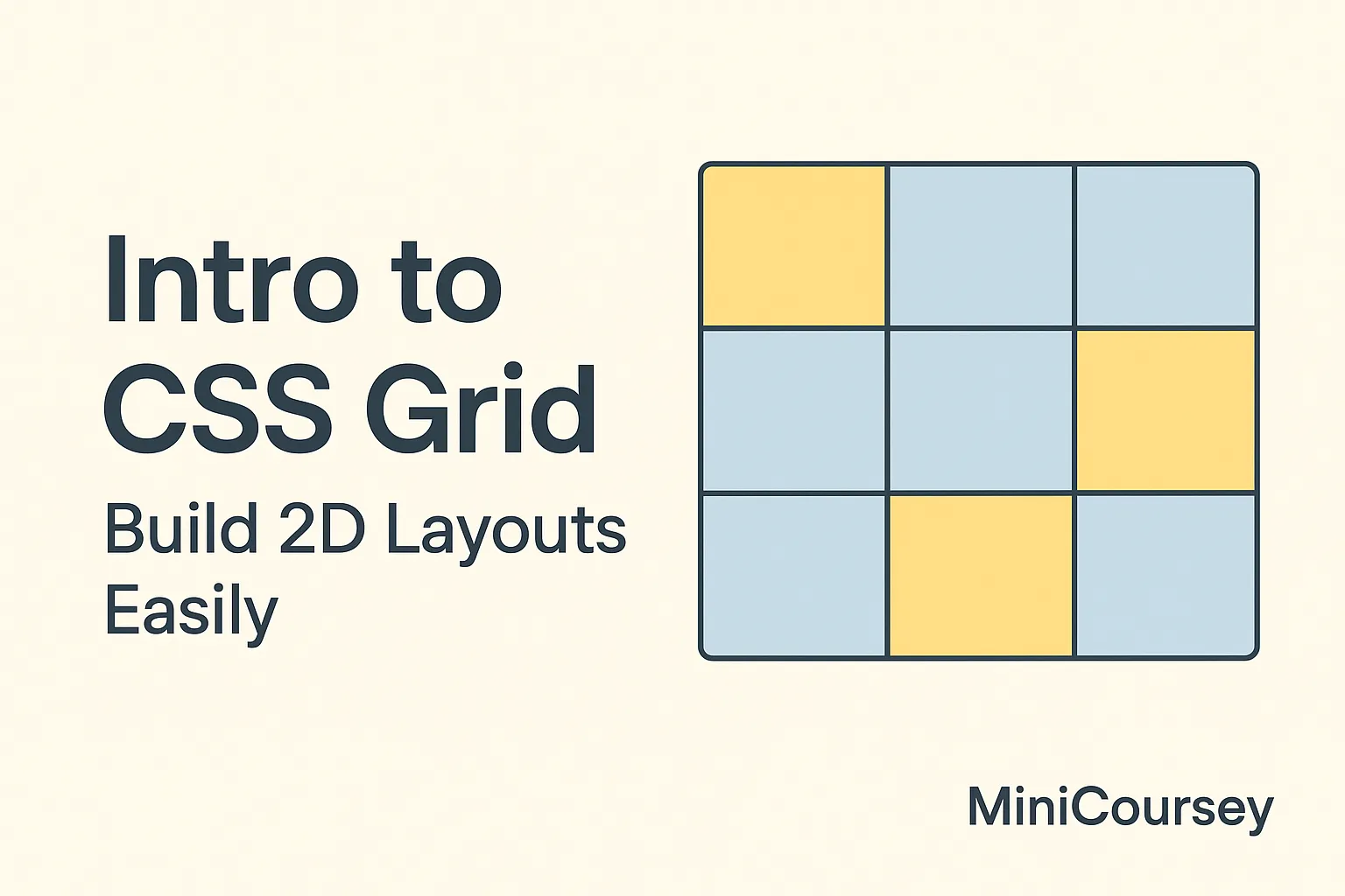
CSS Grid is a layout system for building two-dimensional layouts — rows and columns — easily, without floats or positioning hacks.
Basic Grid Container
To start, define a grid container using display: grid.
.container {
  display: grid;
}
Setting Columns and Rows
Use grid-template-columns and grid-template-rows to define your grid structure.
.container {
  display: grid;
  grid-template-columns: 1fr 1fr;
  grid-template-rows: auto;
}
Placing Items
Use grid-column and grid-row to position items.
.item1 {
  grid-column: 1 / 2;
  grid-row: 1;
}

.item2 {
  grid-column: 2 / 3;
  grid-row: 1;
}
Gap and Alignment
Add space between grid items with gap.
.container {
  gap: 20px;
}
💡 Pro Tip: Use
repeat()to create flexible grids easily. Example:grid-template-columns: repeat(3, 1fr);
⚠️ Common Mistake: Mixing Grid and Flexbox properties on the same container can cause unexpected results.
FAQ
Q: Should I use Grid or Flexbox?
A: Use Flexbox for one-dimensional layouts, Grid for complex two-dimensional layouts.
Q: Is Grid supported by all browsers?
A: Yes, modern browsers fully support CSS Grid.
Related Link
👉 Check out previous: Responsive Design Basics — Make Your Site Mobile-Friendly
Where to Learn More
Experiment with CSS Grid on CodePen or learn advanced techniques on MDN Web Docs.
Conclusion
Congrats — you now know how to build flexible 2D layouts with CSS Grid! Keep experimenting and mixing Grid with Flexbox for ultimate layout power.
✨ Bookmark MiniCoursey for more quick & free mini courses!