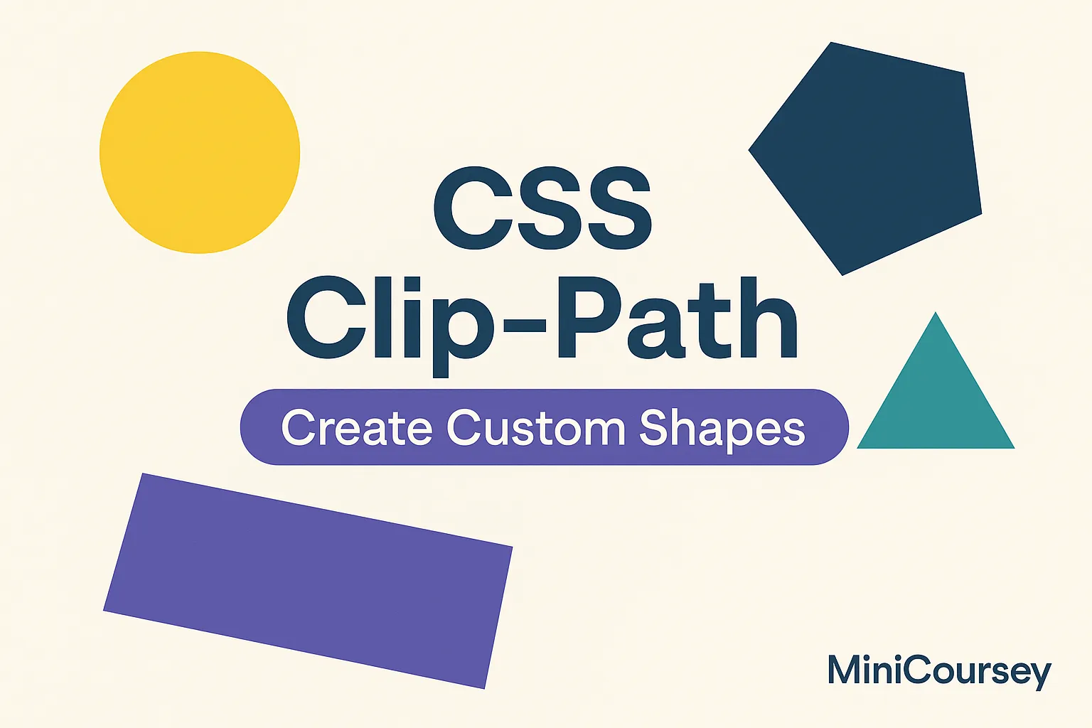
Want to break out of boring rectangles? CSS clip-path lets you create custom shapes and masks for images and elements without editing the image file itself. This powerful property makes it easy to build modern layouts with circles, polygons, or complex shapes — perfect for hero sections, cards, or fancy image grids. In this MiniCoursey quick guide, you’ll learn how clip-path works, how to use basic shapes, and how to get creative with custom paths.
What is Clip-Path?
The clip-path property defines a visible area of an element by clipping it to a specific shape. Everything outside the shape is hidden. It’s like cropping — but with pure CSS!
Basic Shapes
You can clip elements to circles, ellipses, or polygons easily.
.circle {
  clip-path: circle(50%);
}

.ellipse {
  clip-path: ellipse(60% 40%);
}

.polygon {
  clip-path: polygon(50% 0%, 0% 100%, 100% 100%);
}
Practical Uses
Use clip-path for creative image masks, decorative shapes, or to add angled edges to sections. It’s great for making a design stand out with very little code.
💡 Pro Tip: Use online generators like Clippy to create complex shapes visually and copy the CSS.
⚠️ Common Mistake: Not all shapes work well on all screen sizes — test responsiveness!
FAQ
Q: Can I animate clip-path?
A: Yes! You can transition or keyframe clip-path values for cool reveal effects.
Q: Does clip-path affect layout?
A: It only hides parts visually — the full element still takes up its normal space in the flow.
Related Link
👉 Check out previous: CSS Filters — Add Effects to Images & Elements
Where to Learn More
Try MDN’s Clip-Path guide for more shape types and tips. Experiment by layering shapes and combining with transitions for creative layouts.
Conclusion
Congrats — you now know how to shape your elements with clip-path! Use it to add unique, modern design touches without editing your images in a graphics program.
✨ Bookmark MiniCoursey for more quick & free mini courses!