Want to make your designs pop off the page? CSS Shadows are a quick and easy way to add depth, contrast, and visual interest to your elements. Whether you’re adding subtle shadows for a clean, modern look or dramatic depth for eye-catching buttons and cards, mastering box-shadow and text-shadow will instantly improve your designs. In this MiniCoursey quick guide, you’ll learn how shadows work in CSS, how to write clear shadow syntax, and best practices for using them well.
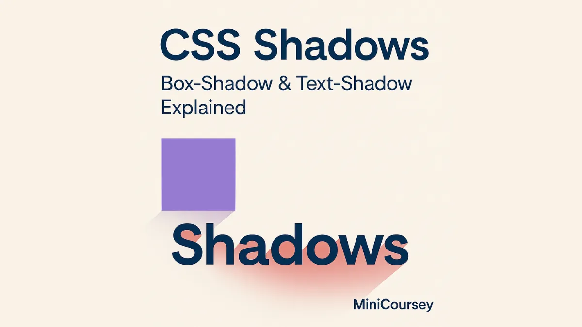
Box-Shadow
The box-shadow property adds shadow effects to elements like divs, buttons, or cards. The basic syntax includes horizontal offset, vertical offset, blur radius, spread, and color.
.card {
  box-shadow: 0 4px 8px rgba(0, 0, 0, 0.2);
}
Multiple Shadows
You can layer multiple shadows by separating them with commas — great for creating subtle depth or fancy glow effects.
.button {
  box-shadow: 0 2px 4px rgba(0,0,0,0.1),
              0 6px 12px rgba(0,0,0,0.1);
}
Text-Shadow
The text-shadow property works similarly but applies to text. It can be used for subtle contrast or bold neon effects.
h1 {
  text-shadow: 2px 2px 4px rgba(0,0,0,0.3);
}
💡 Pro Tip: Keep shadows subtle for a modern look. Heavy shadows can feel outdated if overused.
⚠️ Common Mistake: Avoid using black shadows at full opacity — it often looks harsh. Use rgba() for transparency.
FAQ
Q: Can I animate shadows?
A: Yes! Combine box-shadow with transitions for smooth hover effects.
Q: Do shadows impact performance?
A: Minimal — they’re lightweight. Just avoid stacking heavy shadows on many elements if performance is critical.
Related Link
👉 Check out previous: CSS Transforms — Rotate, Scale, and Translate Elements
Where to Learn More
Experiment with soft vs. hard shadows, layered shadows, and colorful glows. MDN’s Box-Shadow and Text-Shadow pages have excellent examples and tips.
Conclusion
Congrats — you now know how to add depth and style with CSS Shadows! Use them to make buttons pop, cards stand out, and headlines shine.
✨ Bookmark MiniCoursey for more quick & free mini courses!