Wondering what the difference is between px, em, and rem units in CSS? Choosing the right unit is key to building responsive, scalable, and maintainable designs. In this MiniCoursey quick guide, you’ll learn what each unit means, when to use it, and why modern web designers prefer relative units like em and rem over fixed px in many situations.
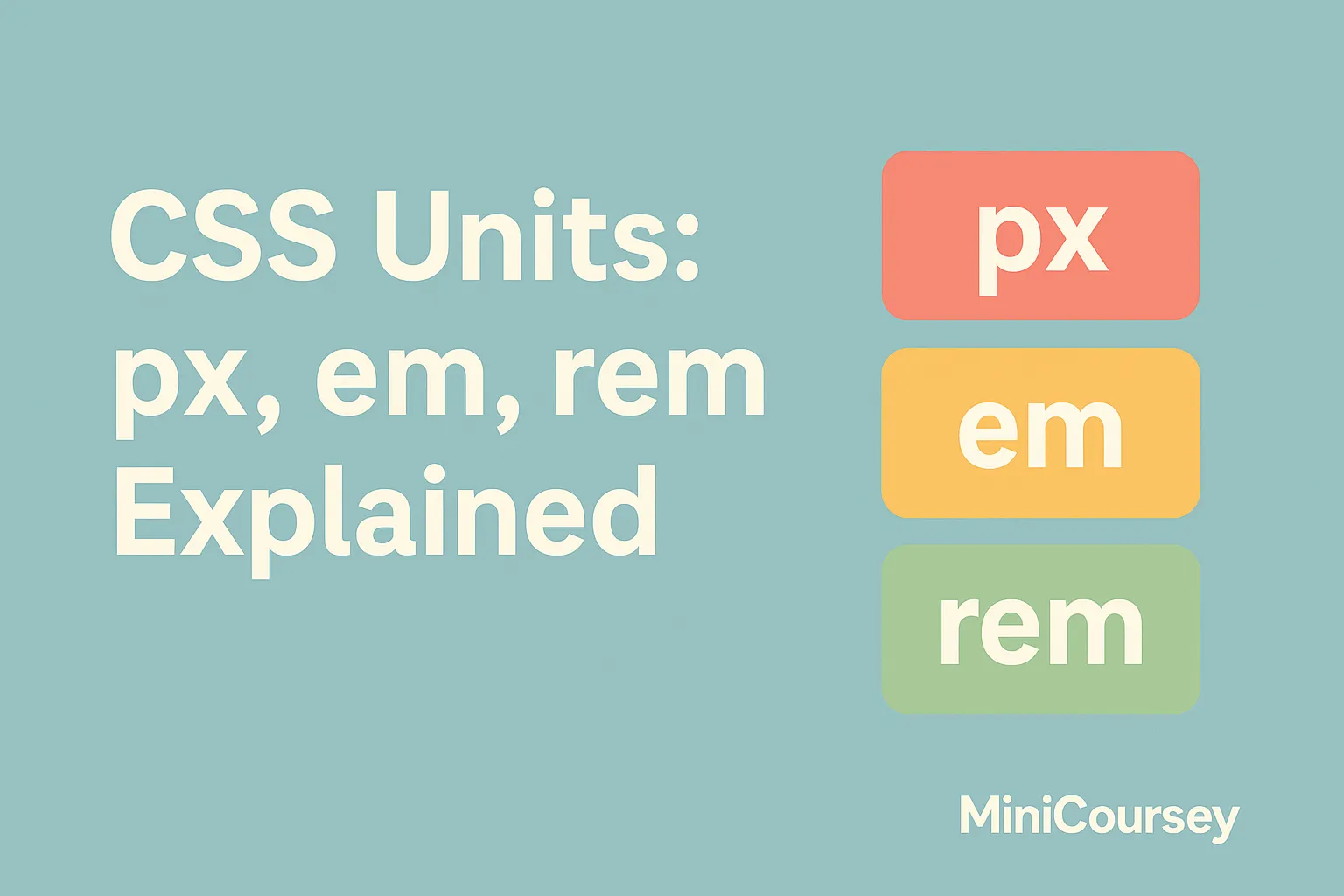
What are CSS Units?
CSS uses units to define sizes for fonts, spacing, widths, and more. There are two main types: absolute units (like px) and relative units (like em and rem). Absolute units stay the same no matter what, while relative units scale based on parent or root element settings.
px: Pixels
Pixels (px) are fixed units — one pixel on the screen. They’re simple and predictable, so they’re great for borders, icons, or when you need exact sizes. However, relying too much on px can make it harder to build truly responsive designs, since they don’t adapt naturally to user font settings or different devices.
em: Relative to Parent
The em unit is relative to the font size of its parent element. For example, if a parent is set to 16px, then 1em equals 16px. Nesting em can lead to compounded sizes, so it’s powerful for modular design but requires careful planning.
p {
  font-size: 1em; /* same as parent */
}

.button {
  padding: 1em 2em; /* scales with font size */
}
rem: Relative to Root
The rem unit (root em) is relative to the root <html> font size. This makes it easier to maintain consistent scaling across your whole project.
html {
  font-size: 16px;
}

h1 {
  font-size: 2rem; /* 32px */
}
💡 Pro Tip: Use rem for base layout and typography, em for component-level scaling, and px for fine-tuning small details.
⚠️ Common Mistake: Mixing too many units randomly can make your styles inconsistent and hard to debug.
FAQ
Q: Should I avoid px completely?
A: Not at all — just use it wisely! Relative units work best for scalable design, but px is great for small fixed elements.
Q: How do I choose em or rem?
A: Use rem for global scaling and em for local adjustments within components.
Related Link
👉 Check out previous: CSS Flexbox vs Grid — When to Use Each
Where to Learn More
Experiment with changing your root font size and watch how rem units adjust automatically. MDN’s CSS units guide is a must-read for more examples and edge cases.
Conclusion
Congrats — now you understand the core CSS units! Using px, em, and rem wisely will help you write flexible, responsive stylesheets that scale beautifully on any device.
✨ Bookmark MiniCoursey for more quick & free mini courses!