CSS @layer — Organize Your Stylesheets

css @layer

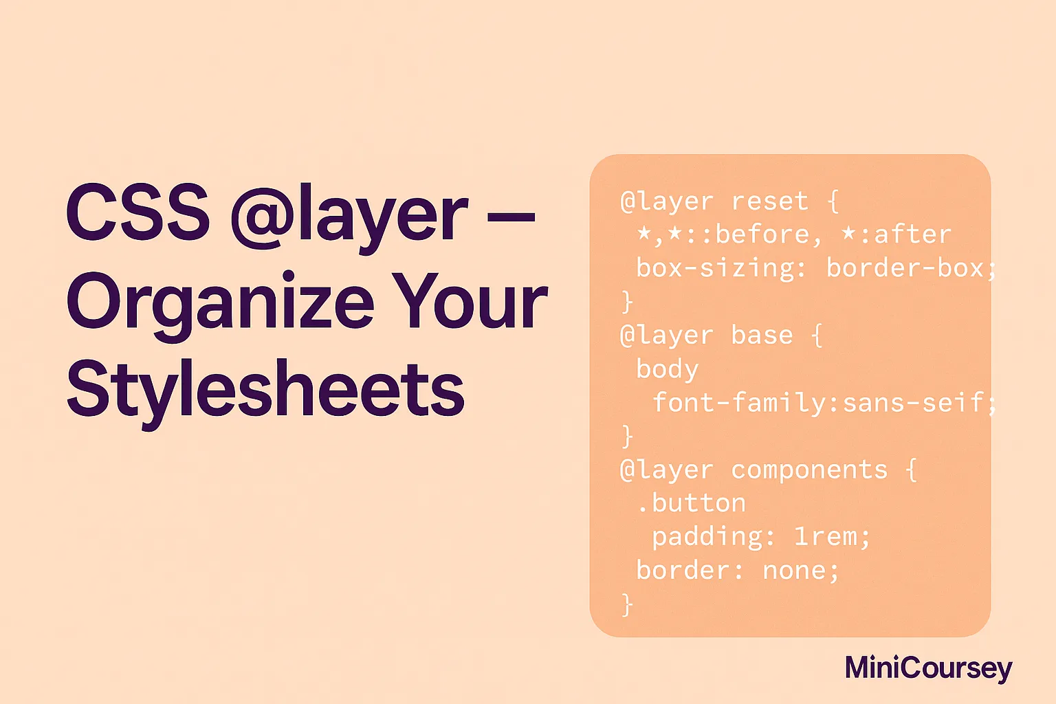
Keeping your CSS organized as a project grows can get tricky fast. The new @layer rule in CSS helps you manage your stylesheets in clear, structured layers. It’s perfect for controlling how resets, base styles, utilities, and components stack in the cascade — all without weird specificity battles. In this MiniCoursey quick guide, you’ll learn … Read more

CSS :is() and :where() — Write DRY Selectors

css is() and where()

Ever get tired of repeating long selectors just to apply the same styles to multiple elements? The new :is() and :where() pseudo-classes solve this problem beautifully! They let you group selectors together in a single, clean rule — making your CSS shorter, more maintainable, and easier to read. In this MiniCoursey quick guide, you’ll learn … Read more

CSS Aspect-Ratio vs Container Queries — When to Use Each

css aspect-ratio vs container queries

Aspect-Ratio and Container Queries are two of the most powerful modern CSS tools — but they solve very different problems! Understanding when to use each unlocks more flexible, component-based layouts that adapt beautifully. In this MiniCoursey quick guide, you’ll learn what aspect-ratio and Container Queries do, how they differ, and how to combine them for … Read more

CSS Aspect-Ratio vs Object-Fit — Key Differences

css aspect-ratio vs object-fit

Ever wonder when to use aspect-ratio and when to use object-fit? Both help control how elements like images and videos fit inside containers — but they solve different problems! Understanding the difference is key to creating clean, responsive layouts. In this MiniCoursey quick guide, you’ll learn how aspect-ratio and object-fit work, how they’re different, and … Read more

CSS Subgrid — Better Nested Layouts with Grid

css subgrid

Love CSS Grid but struggle with aligning nested items? Meet Subgrid! The CSS subgrid feature lets child grid containers inherit the parent grid’s row or column tracks. This means you can build perfectly aligned nested layouts without repeating track definitions — perfect for cards, lists, or complex UI sections. In this MiniCoursey quick guide, you’ll … Read more

CSS Container Queries — Smarter Responsive Design

css container queries

Ever wish your components could adapt based on their container’s size instead of the whole viewport? With CSS Container Queries, you can! This new, powerful feature lets your elements respond to the space they live in — perfect for flexible, reusable components that stay looking great in any layout. In this MiniCoursey quick guide, you’ll … Read more

CSS Clamp() — Fluid Sizing with Min and Max

css clamp function

Want fluid, responsive sizes without breakpoints overload? The CSS clamp() function makes it easy to scale font sizes, widths, or margins while setting clear min and max limits. This means your layouts adapt smoothly but never break or get too small. In this MiniCoursey quick guide, you’ll learn what clamp() does, how to write clear … Read more

CSS Scroll Behavior — Smooth vs Instant

css scroll behavior

Want to control how your page scrolls when users click anchor links or buttons? The CSS scroll-behavior property lets you choose between smooth scrolling or instant jumps — all without extra JavaScript! This small but powerful property adds a polished feel to your site, especially for single-page layouts, back-to-top buttons, or in-page navigation. In this … Read more

CSS Scroll Snap — Smooth Scrolling Experiences

css scroll snap

Want to build sliders, carousels, or sections that snap perfectly as you scroll? The CSS scroll-snap feature makes it easy to create smooth, precise scroll experiences without relying on heavy JavaScript libraries. Whether you’re building a horizontal slider or snapping to sections vertically, scroll-snap makes it feel polished and user-friendly. In this MiniCoursey quick guide, … Read more

CSS Writing Modes — Vertical & RTL Layouts

css writing modes

Did you know you can flip text direction and build vertical layouts with pure CSS? The writing-mode property is a powerful tool for creating multilingual sites, print-like layouts, and creative vertical sections. Whether you’re designing for East Asian languages, RTL scripts like Arabic, or just want an eye-catching headline, mastering writing modes unlocks new design … Read more